
Having a mobile-friendly website is essential for success in the current digital era. With the increasing number of users accessing the internet through mobile devices, it is essential to optimize your website to provide a seamless browsing experience across all devices. In this article, we will explore effective strategies to make your website mobile-friendly and ensure its responsiveness on various devices.
The Importance of a Mobile-Friendly Website
In the digital era, smartphones and tablets have become an integral part of our lives. People rely on their mobile devices to search for information, make purchases, and connect with others. Hence, having a mobile-friendly website is not just an option but a necessity.
- Advertisement -
A mobile-friendly website ensures that your content is accessible and visually appealing across various devices. It improves user experience, encourages extended browsing sessions, and ultimately increases traffic to and conversions from your website. Now, let’s delve into the steps to make your website mobile-friendly.

- Advertisement -
Understanding Mobile Responsiveness
Mobile responsiveness refers to a website’s ability to adapt and display correctly on different screen sizes and resolutions. It ensures that your website looks and functions optimally, regardless of the device used to access it. Whether it’s a smartphone, tablet, or desktop computer, your website should provide a seamless user experience.

Choose a Responsive Web Design
To create a mobile-friendly website, it is crucial to opt for a responsive web design. Responsive design allows your website layout and elements to automatically adjust and adapt to the user’s screen size. This approach eliminates the need for separate mobile and desktop versions of your website, making maintenance more manageable.

Optimize Page Load Speed
Page load speed is a critical factor in the mobile user experience. High bounce rates and irritation might result from slow-loading pages.To optimize page load speed, minimize HTTP requests, compress images, enable browser caching, and minimize unnecessary scripts and plugins. By reducing load times, you provide a better experience for mobile users.

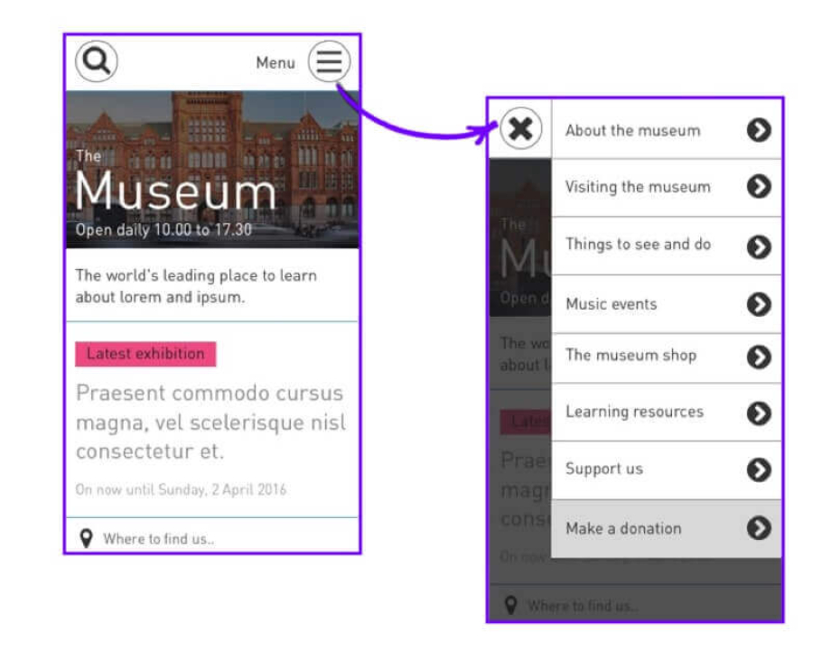
Streamline Navigation
Navigation plays a crucial role in user engagement. On a mobile device, limited screen space calls for streamlined navigation menus. Use a concise and clear menu structure, hamburger menus, and strategically placed navigation elements to facilitate easy navigation on smaller screens.
Optimize Images and Media
Images and media files contribute significantly to page size and load time. Optimize your images by resizing them appropriately and compressing them without compromising quality. Additionally, consider using responsive media queries to ensure that media elements scale proportionally across different devices.

Use Mobile-Friendly Fonts
Choose fonts that are legible on smaller screens. Some fonts may appear too small or pixelated on mobile devices, affecting readability. Stick to widely supported web fonts that are readable on both desktop and mobile platforms.

Implement Touch-Friendly Elements
Mobile devices rely heavily on touch interactions. Ensure that your website’s buttons, links, and interactive elements are easily tappable and responsive to the touch. Use an appropriate size for buttons, with enough spacing between them to prevent accidental taps. Remember, a frustrating user experience can quickly drive visitors away from your website.

Test Across Different Devices and Browsers
To ensure your website is truly mobile-friendly and responsive across all devices, it’s vital to test it on various devices and browsers. Emulate different screen sizes and resolutions to see how your website adapts. Check for any inconsistencies or layout issues and make necessary adjustments to optimize the user experience on all platforms.

Ensure Compatibility with Different Screen Sizes
Mobile devices come in various screen sizes, ranging from small smartphones to large tablets. Your website should be designed to accommodate these differences seamlessly. Avoid fixed-width elements and use fluid grids and flexible layouts to ensure your website adjusts gracefully to different screen sizes.
Use Responsive Meta Tags
Responsive meta tags provide instructions to browsers on how to scale and display your website on different devices. Utilize the viewport meta tag to specify the viewport width and initial scale of your website. This helps browsers render your content appropriately, enhancing the overall mobile experience.
Prioritize Content and Readability
When designing for mobile, it’s essential to prioritize content and readability. Optimize your content for mobile consumption by keeping paragraphs concise and using bullet points or numbered lists to break up information. Ensure that fonts are legible and that there is enough contrast between text and background colors. Clear and easily scannable content keeps users engaged and encourages them to explore your website further.
Improve User Experience with Intuitive Forms
Forms are an integral part of many websites, whether it’s for contact forms, sign-ups, or surveys. When designing forms for mobile devices, keep them simple, intuitive, and easy to fill out. Use appropriate input fields, provide clear instructions, and minimize the number of required fields. Additionally, consider implementing auto-fill and validation features to enhance the user experience and reduce form abandonment.
Mobile-Friendly SEO Practices
Making your website mobile-friendly goes hand in hand with optimizing it for search engines. Mobile-friendliness is a ranking factor in search engine algorithms, and a mobile-friendly website is more likely to appear higher in mobile search results. Ensure your website follows mobile SEO best practices, such as using descriptive page titles, and meta descriptions, and optimizing for local search if applicable.
Conclusion
In today’s mobile-driven world, having a mobile-friendly and responsive website is vital for success. By implementing the strategies outlined in this article, you can ensure that your website provides an exceptional user experience across all devices. From choosing a responsive web design to optimizing page load speed, navigation, and content, every aspect contributes to a seamless mobile experience. Embrace mobile-friendliness, and watch your website thrive in the digital landscape.
FAQs
Q: How do I know if my website is mobile-friendly?
A: You can use Google’s Mobile-Friendly Test tool to check the mobile-friendliness of your website. Simply enter your website’s URL, and the tool will analyze its responsiveness and provide recommendations.
Q: Can I convert my existing website into a mobile-friendly one?
A: Yes, you can convert your existing website into a mobile-friendly version. Consider using a responsive web design framework or consulting a professional web developer to help you with the transition.
Q: Does mobile-friendliness affect my website’s search engine rankings?
A: Yes, mobile-friendliness is a ranking factor in search engine algorithms, especially for mobile search results. Having a mobile-friendly website can positively impact your search engine rankings.
Q: How often should I test my website’s mobile-friendliness?
A: It’s a good practice to periodically test your website’s mobile-friendliness, especially after making any design or content